


Introduction
In this tutorial, we want to create a Violinplot. In order to do this, we use the violinplot() function of Seaborn.
Import Libraries
First, we import the following python modules:
import seaborn as sns
import matplotlib.pyplot as plt
Load Data
We would like to use a seaborn sample dataset. Let's load the "penguins" dataset into python.
penguins_df = sns.load_dataset("penguins")

penguins_df.head()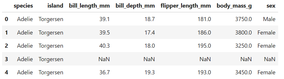
Plot Violinplot
Now, we would like to visualize the data with a violinplot. A violinplot is similar to a boxplot, but in addition the underlying distribution for each category is visualized.
We want to analyze the body mass for each penguin species. In order to do this, we use the violinplot() function from seaborn. As x values we take the column "species" and as y values we take the column "body_mass_g" of the DataFrame.
#figure style
sns.set_style('whitegrid')
fig, ax = plt.subplots(figsize=(12, 7))

#violinplot
sns.violinplot(x='species', y='body_mass_g', data=penguins_df, kind="kde")

plt.show()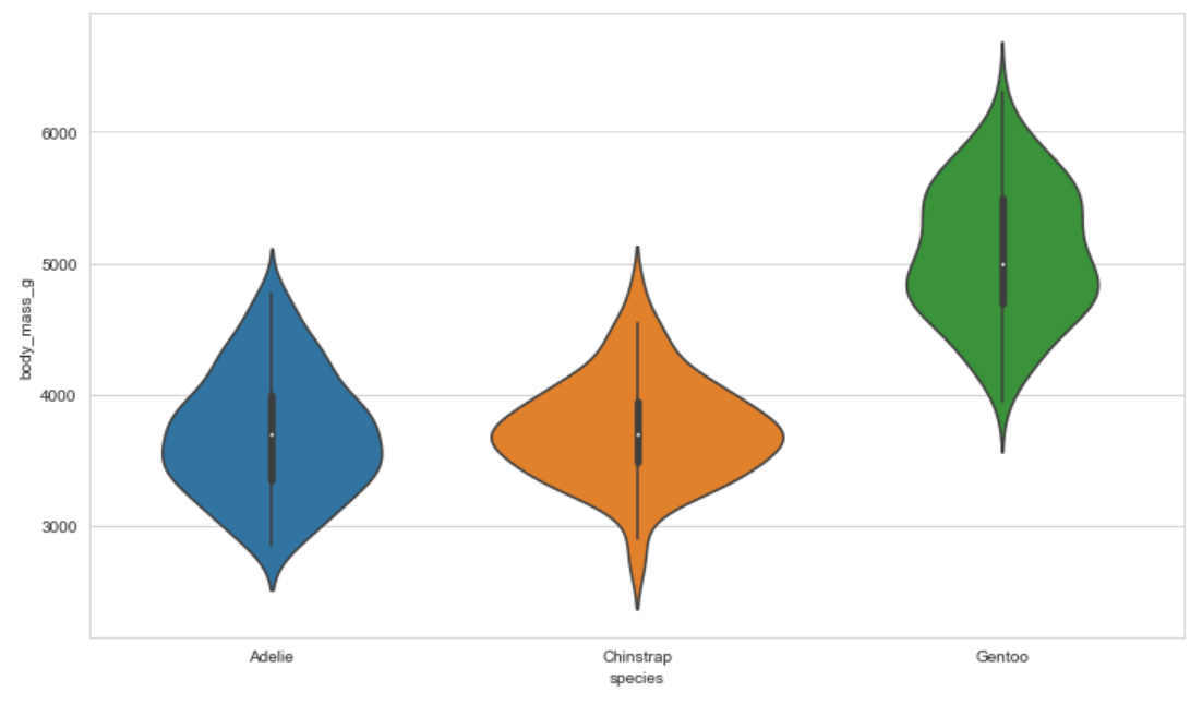
Conclusion
Congratulations! Now you are one step closer to become an AI Expert. You have seen that it is very easy to create a Violinplot. We can simply use the violinplot() function of Seaborn. Try it yourself!
Also check out our Instagram page. We appreciate your like or comment. Feel free to share this post with your friends.